As athletes, we’re always on a quest to become a better “machine.” It’s fairly easy to measure progress by external metrics – meaning pace or power. We can see when we are getting faster splits in the pool, or pushing a higher power at the same heart rate on the bike. But it’s a little more complicated to see what’s going on inside. I’m definitely a proponent of various kind of physiological testing. And as I will be racing a 70.3 this season as my ‘A’ race, I am interested in knowing what’s going on so that I can race my best.
I opted for metabolic efficiency testing as I don’t have a metabolic cart I’m not able to test this myself, and I was curious to see how my body is behaving when it comes to burning fuel sources. I scheduled an appointment with Dina Griffin at eNRG Performance in Littleton for a bike and run test. Back in 2011, before I did my first ironman and was getting myself familiar with the metabolic efficiency concept, I worked with Bob Seebohar and for a run metabolic efficiency test. It’s also when I met Dina for the first time. Therefore getting retested 5 years later will provide me with some good information on if anything had changed, and if so, where I stand as I get ready for a solid race season.
THE TEST
The test is done in a fasted state – 10 to 12 hours of nothing but water. For those of us who dread our annual blood tests because of the fasting requirement, this might be a little worse, but it somehow makes that post-fast meal even more enjoyable. My test was scheduled for 9am so around 9:30pm I had a smoothie with some UCAN, almond milk, and peanut butter and then hit the hay.
In the morning I did my routine yoga and then packed up the car with my bike and other gear, and my dog. I dropped my dog off for a play date at my brother’s house and then continued north to Littleton. I arrived in plenty of time – thank goodness for favorable traffic conditions!
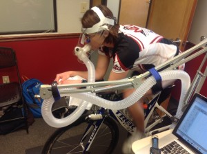
Dina was already there in the testing room. We got my bike on the Wahoo KICKR, and then we discussed the protocol. I would be doing 4 minute stages on the bike and run. I had already filled out a questionnaire ahead of time with some basic information, but it was nice to confirm our starting wattage and pace.
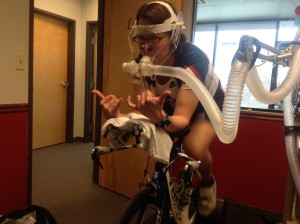
The test data is collected via a metabolic cart. Basically I’m hooked up to this machine via a mouthpiece that’s got a one-way valve on it, and then a hose goes into the gas analyzer. I breathe in external air, but everything I expire goes through the hose to the machine. It’s looking for quantities of CO2 and O2 and the software calculates their ratio (the Respiratory Exchange Ratio, RER.) That number tells us how much fat and carbohydrate I’m burning. I won’t go much into the chemistry – you can read about it here. In short, oxidation of a carbohydrate molecule and a fatty acid molecule use different amounts of oxygen, and the oxidation of hydrocarbons always produce CO2 and H2O, so looking at the CO2 to O2 ratio tells us what substrates we are using as fuel. Who likes balancing chemical equations? I do, I do!
Once we get a few minutes of a resting RER (me sitting in a chair) it’s time for me to hop on the bike. I’m anxious to get started. For one I’m looking forward to seeing the data. And also the sooner I start, the sooner I finish, and the sooner I get to eat! During the test we’re looking for the point where I hit 50% carbohydrate and 50% fat (if at all), and that is the Metabolic Efficiency Point (MEP.) The more “metabolically efficient” I am, the higher the fat percentage burned will be and the closer the MEP is to my threshold pace, the better.
Bike
My FTP is somewhere around 150-160W, so we started at 60W and then went up in 20W stages, with the final one at 160W. I just slightly “crossed over” the MEP at 160W. For me, this is also where my breathing got significantly more labored. While my legs were feeling reasonably good for this final effort at threshold, I was happy I didn’t have to do any more. (I have data that much above this power it’s pretty tough – a post on that Moxy data is in the works.) I will note I did wear Moxy monitors on both outer quads to get additional data, and that’s in the results section. After the bike we wanted a fairly quick transition to the run. I swapped shoes, got a short break from the metabolic cart mouthpiece, grabbed some water, and used the restroom before the run.
Run
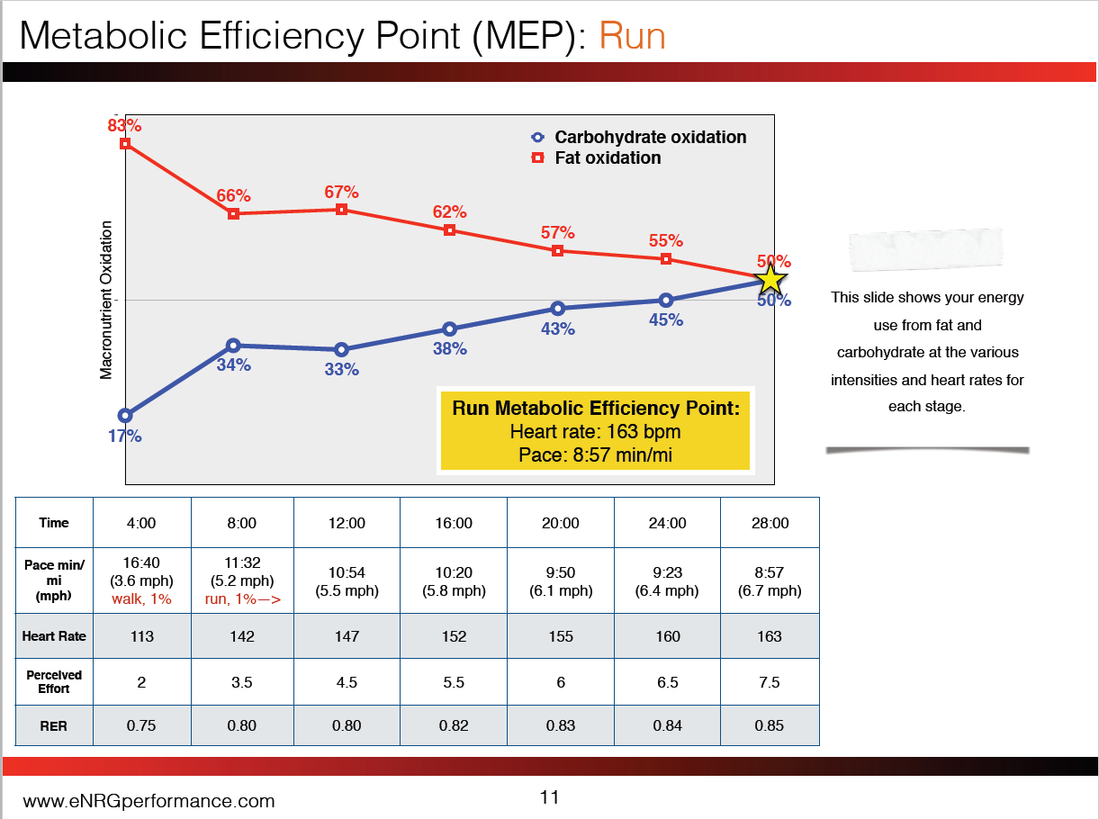
The run test is the same protocol – four minute stages of increasing intensity. We started at a walk for a few minutes (3.6mph) to let me get settled in on the treadmill. I had estimated my threshold being around a 9:00min/mile pace, so we started at 5.2mph (1% incline) and ramped 0.3mph every 4 minutes. I hit my MEP around 6.7mph, so 8:57min/mile, and that’s really close to what my threshold is.
Throughout both tests, Dana would ask me what my RPE (rate of perceived exertion) for that stage was, and I would either use my fingers or point to a number on the chart she put in front of me. With that mouthpiece in, you can’t talk!
She took the power/pace data, my heart rate data, my RPE, and RER to give a picture of what was going on.
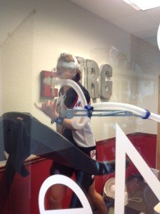
After I finished the tests, Dina put together preliminary charts while I cleaned up, had a post-workout snack of vanilla cream UCAN and coffee, as I’d eat my meal on the way to my next appointment. We looked at the charts, went over what a typical training week looked like for me, and she also suggested some additional blood tests to get. My next appointment was actually with my neurologist for a regular follow-up and to make sure the medication I’m on isn’t adversely affecting me in ways we can’t see (same as why we do physiological testing!) Since they were drawing blood anyway, my PA easily agreed to add the a few additional ones that Dina recommended.
THE RESULTS
What did we learn from all this. First, I’m pretty efficient on the bike. This makes sense as the bike makes up about half of my training time. My run is about a quarter of my total training time, and while I was “efficient” on the run, it was clearly not as good on the bike. Let’s look at the charts: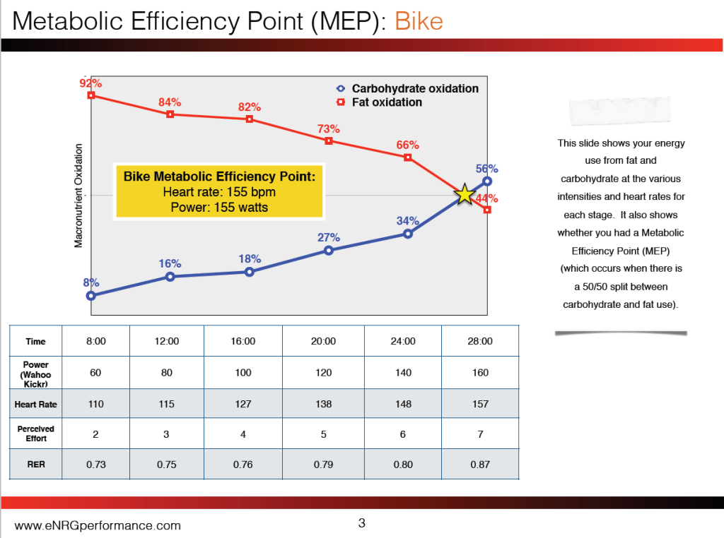
Above is one of many charts provided to me in my report, and this one shows the basic data from the test. The red line is percentage of calories coming from fat, blue is carbohydrate. The chart shows the specifics from the test. As my intensity increases, I start using greater percentage of carbohydrate, but don’t cross over until I’m almost at 160W.
Additional charts provided in the report went into further detail. I learned the actual number of calories from carbohydrate and fat I burned during each stage, as well as recommended ranges of total calories per hour and recommended ranges of calories from carbohydrates per hour. Those recommendations are based on what my body does at those intensities, not a one-size-fits-all recommendation.
Here’s the run chart:
We see that at my easy paces I’m only burning 66% fat on the run, where on the bike I was in the low 80s. This certainly makes sense because I’ve spent a lot more base time on the bike than the run these last two years since my hip surgeries.
Blood work results: I’ve got some “work” to do here. The University of Colorado Hospital got me my results quickly (within an hour of the draw.) What we found was that some of my iron-related tests were quite low, so now I’m looking into supplementation in conjunction with my primary care doc to get back to reasonable levels for an endurance athlete.
Dina also provided me with meal suggestions that follow the metabolic efficiency concept, keeping the blood sugar stable. The general recommendation is ensuring my meals and snacks are set up 1:1 or 2:1 carb:protein ratio, and manipulating which based on the amount and intensity of training I have that day. While I already had a pretty good understanding of what I *should* be doing, hearing this information again with some fresh meal ideas is always good for motivation and to limit my visits to the Dunkin’ Donuts drive-thru…
This test package is for 2 sets of tests, so as I get closer to my A race (Syracuse 70.3 on June 19), I’ll set up an appointment to test again to see how the dietary changes and my continued training affects the metabolic efficiency numbers.
Moxy Data
I had Moxy monitors on both outer quads during the test. This is all the data, I didn’t cut out resting time – the monitors record as soon as you turn them on, and both bike and run data are in the graphs. You can see slightly different time stamps for the starting of the data in each graph, as I was initially going to just record left data as I usually do, but thought it’d be interesting to do both, so right before we started the test I added the right. On the first graph, the data prior to about 9:35 is me sitting talking to Dina, taking the resting metabolic data, and also a trip to the restroom! Around 9:35 is where I started some easy pedaling to warm-up, then a spin up test to calibrate the Wahoo KICKR. As I’m warming-up the SmO2, (red and blue, left axis) increase, which is expected.
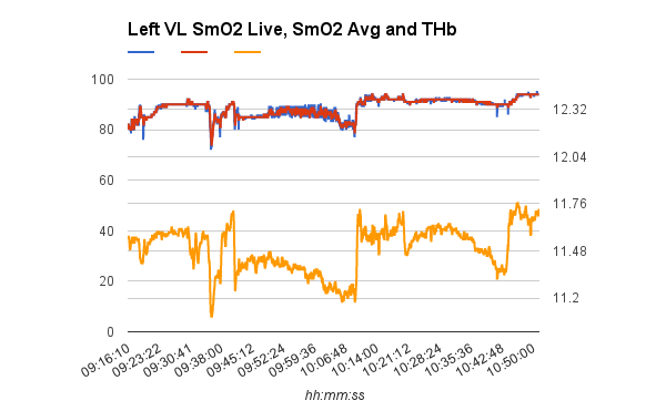
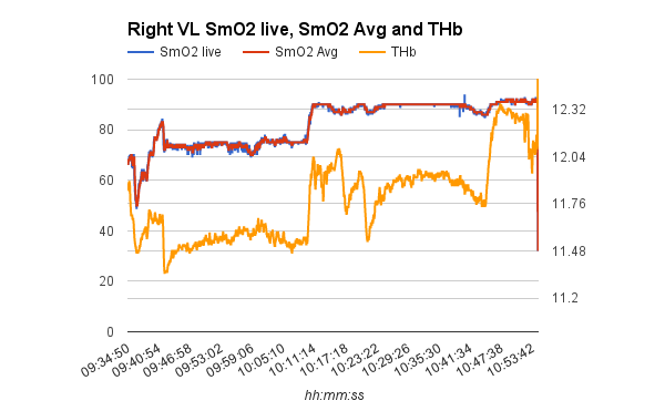
The bike test shows pretty steady SmO2 data, which means I’m in a steady state. Total hemoglobin increases slightly, then steadily drops with each stage. It was only at the last stage around threshold did my left SmO2 drop, but the trend is pretty flat within that stage, meaning I was still able to reach a steady state of oxygen delivery to my muscles, just not quite as much as the previous stages. My right leg hold fairly stable throughout, though the total value is slightly different. This could be due to muscle placement – if they aren’t in the exact same spot on the muscle of each leg, the values might be different. So we want to see the trend. Interesting it’s a little different in that last stage, so I’d need to do more investigating!
Were both trend lines jump, that is the break between tests. The break was only a couple minutes, and then around 10:15 I started walking. At approximately 10:20 is where I started a slow run (dip in THb) and then did 6 more 4 minute stages. SmO2 stays pretty flat, but THb goes up and then drops. The last shift in both curves is a walk cool-down I did.
What does this mean? I need to dig into THb trends a bit more, as that’s where the interesting data is. (That’ll be another post.) The flat SmO2 trends at reasonably high levels just means I’m in a good steady state delivering oxygen to my muscles. In simple terms, when the trend slopes down, it means I’m demanding more than I can provide, if it trends up, I’m providing more than I need.
COMPARISON TO 2011 TEST
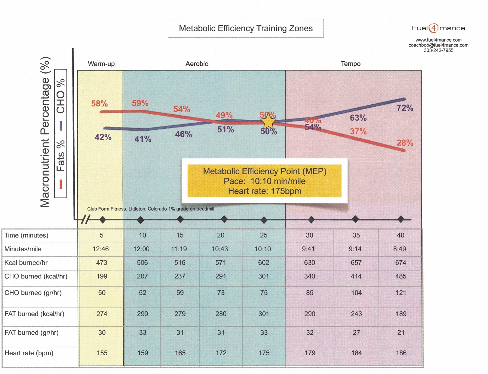
Below is the chart from my 2011 test – quite a different shape of the curve, but the run paces aren’t significantly different, other than I started a tad slower and we did 5 minute stages as I only did a test on the run. So over the last 5 years I’ve definitely become more metabolically efficient!
